

Stephen Colbert, back in his “Daily Show” days, used to have an election-year bit called “Better Know A District.” He would visit one of the 538 U.S. Congressional districts, and do a whole workup on it. Facts and figures, interesting history, interviews with locals, the whole nine.
So when I see an exchange-traded fund like the Simplify Interest Rate Hedge ETF (PFIX), coupled with all of these cross-currents in the media about one of the most consequential periods in bond market history going on right now, it makes for a perfect installment of our new series, Look Both Ways Before You Cross Wall Street.
More Yield, Less Trap: Sign up free to get Barchart’s daily Dividend Investor newsletter straight to your inbox.
This chart will not be as scary as it looks at first, to those less familiar with the history of how we got here on bonds. It shows my take on what’s happened over the last five decades when it comes to the bond market’s benchmark – the equivalent of the S&P 500 Index ($SPX) for stocks – the US Treasury 10-Year Bond ($TNX). This is the one that so much commerce is based on.
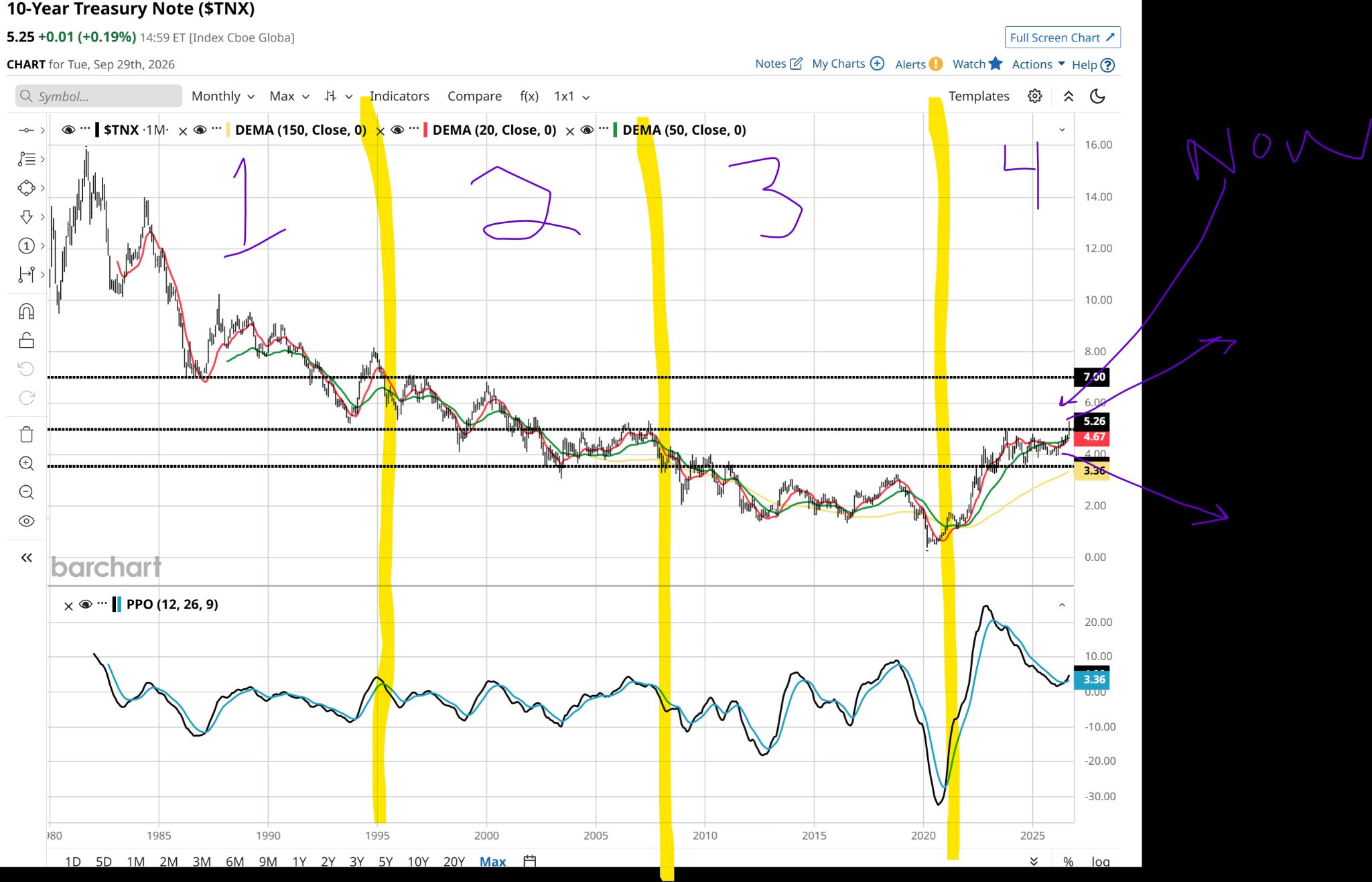 TNX monthly chart.
 The bond rate is in the right hand column, vertically. Rates peaked at close to 16% during the early 1980s. At that time, buying a US 10-Year Treasury Bond would have secured a more than 15% annualized return. That’s 15%, every year, for the next 10 years.
I was a teenager back then, but I was told “they couldn’t give bonds away” back then. Hyperinflation, or at least fears of more of it, were the main culprit.
The current investing generation knows 15% a year as “return.” But they associate it with the SPDR S&P 500 ETF (SPY), which has delivered nearly that much the past five years.
But bonds in 2026? They just want to have fun, too (that’s a request & dedication to a Cyndi L. from NYC).
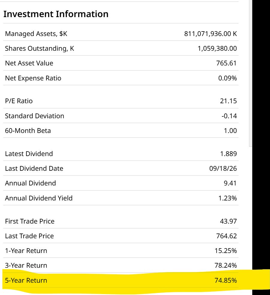 SPY stats.
 And I think they just might have some fun. Yields have spiked, but my chart work still sees at least a viable chance we could see them go higher.
The other three time periods sliced up on that TNX chart above are more straightforward. Rates moved lower during most of the 1980s and 1990s.
But importantly, they moved higher prior to the 2000 dot-com bubble bursting. To me, that rhymes with what we are seeing right now. The current 5%-plus yield was a more “normal” condition at the start of that third phase marked above, before phase three saw them move steadily lower.
That was and is the lasting legacy of the 2008 Global Financial Crisis. Rates went practically all the way to zero.
More recently, we saw the 10-Year Treasury yield rise up again from those depths, and actually enter a “new normal” for a while. As we see in this closeup of the past five years, and as I’ve written here often, that 3.5%-5.0% yield range was full of “fakeout breakouts.”
But it hung around that range for more than three years.
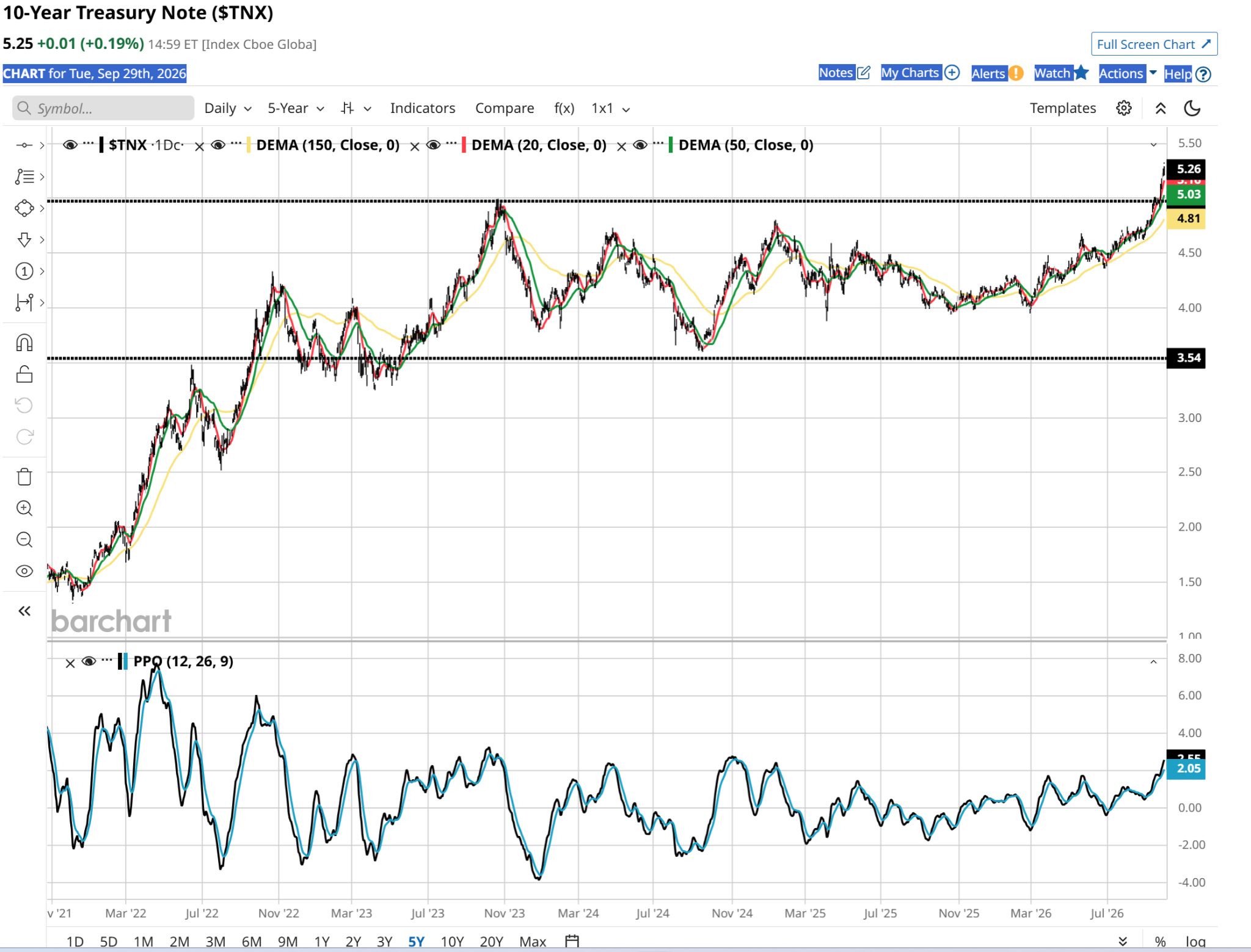 TNX 5-year daily chart.
 What happened next, very recently, is what I firmly believe is the biggest gift the financial markets could ever provide to my Baby Boomer and Gen-X peers:
Rates we can live with…and live on.
Without having to rely so much on the algorithmically-biased stock market that now surrounds us.
The Elephant in the Bond Market
As Groucho Marx once said, “I shot an elephant in my pajamas. How he got in my pajamas, I’ll never know.”
As a newly-minted bond investor, you have to understand that at all times, you walk around with an elephant. More on your back than in your jammies, but it’s there nonetheless.
We all know that stocks can get crushed at times. Some will recover, and some will go the way of Enron from the old days, or GameStop (GME) from more recent days – a stock that ran from near-zero to $120 at its 2020 peak, and sits under $24 a share today.
Bonds won’t give us that type of ride. And they don’t care about a particular company’s earnings or valuation. Bonds are really just contracts between you (the buyer/holder) and the issuer (either the US Government for Treasuries, or a corporation/municipality, etc.).
How long that contract lasts (when does the bond mature for 100 cents on the dollar, aka “par value”) and whether or not there is a realistic risk that 100 cents won’t be paid in full or at all (credit risk) are the key factors. Maturity length and bond quality, plus what the bond’s interest rate was when you bought it.
Even in the case of bond ETFs, they are simply baskets of bonds, in the same way SPY is a basket of all of the S&P 500 stocks.
The wildcard is the direction of interest rates after you buy the bond or bond ETF. Again using US Treasuries as our example: If you own the bond, you are going to get paid your 100 cents on the dollar. (If Uncle Sam can’t pay you, we all have bigger problems! That’s my take on it.)
However, the direct risk that remains is how competitive the rate you own the bond or bond ETF at (yield on cost) will be in the future.
Let’s simplify this with a visual. The Invesco Equal Weight 0-30 Year Treasury ETF (GOVI) is an ETF designed to function as a bond “ladder” portfolio. It holds bonds from under one year to maturity, out to 30 years – the whole “yield curve.”
But like most bond ETFs, it does not own those bonds until they mature. It rebalances the portfolio each year, to keep it set up so that 1/30 of the ETF’s assets are invested in each maturity year.
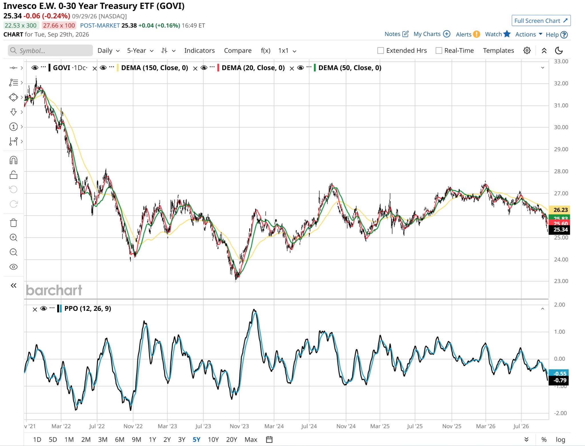 GOVI 5-year daily chart.
 That means when GOVI’s price drops from $32 to $24 (a 25% plunge) in under 12 months’ time, ETF holders are, well, holding the bag.
If they do nothing about it.
PFIX Plays the Hero
Enter our hero. Well, one of them. I have a whole watchlist of ETFs that are built to do the same thing, but in different ways.
As of this writing, bond yields are spiking, so bond prices are tanking, across most of the yield curve. Particular at the longer end, say 10-30 years to maturity.
PFIX can be one of several ways to neutralize that bond price decline. Or, if you don’t own bonds or bond ETFs, PFIX can be used as an offensive weapon. Specifically, to profit from the very fact that rates go up.
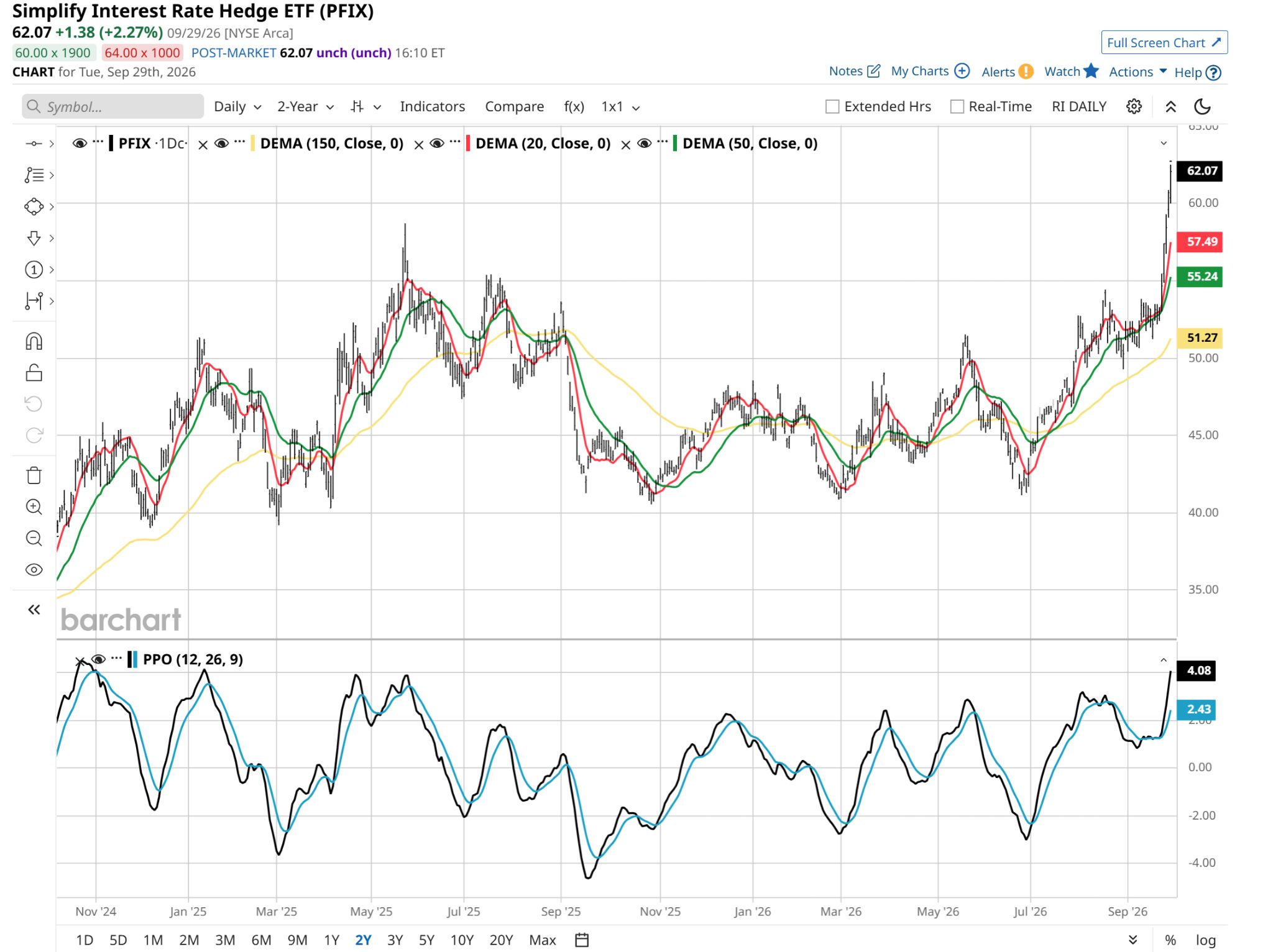 PFIX 2-year daily chart.
 I think that picture above speaks for itself. But I like to talk charts as much as the next investment guy, so I’ll explain it.
PFIX recently rallied from $41 a share to $62 a share. In only three months! That takes a historic move up in rates. But it highlights what these bond hedge ETFs are built to do.
And PFIX is one of the more volatile ones. Which means using it in smaller doses is encouraged, until you understand it very, very well. That’s no different than any ETF you consider.
But in the case of one like this, which is not at all in the vein of “buy SPY or QQQ and chill,” you first have to determine if it should even make your “watchlist.”
That’s where I keep my “might own at some point” ETF roster. Like a Major League Baseball team, I always have my starting players, bench players, minor leaguers, and those from other teams (not currently followed by me) that I am considering trying to bring into the fold.
How Does PFIX Work?
Remember, an ETF like PFIX is designed not to “beat the stock market.” It actually has very little in common with the stock market. It is specifically designed to appreciate in price when long-term interest rates rise. That’s when bond prices fall.
So whereas our typical bond ETF, like a bond itself, goes up in price when rates decline, PFIX does the opposite. That’s how it can succeed over a long-term cycle of higher rates. In other words, the opposite of what happens to ETFs like TLT, which own long-term bonds.
If you are looking for an easy-to-understand guide to the holdings for this ETF or many others in its peer group (the ones that hedge/profit from declines in bonds, stocks, etc.), you won’t find it easily.
I may be the “ETF guy” around here, but that doesn’t mean I do not have ongoing frustrations with how some issuers of complex alternative ETFs present their holdings. No specific finger-pointing there; just some context as to why I am explaining what you see below. You can also view this video from the issuer (Simplify) which explains what a “swaption” is.
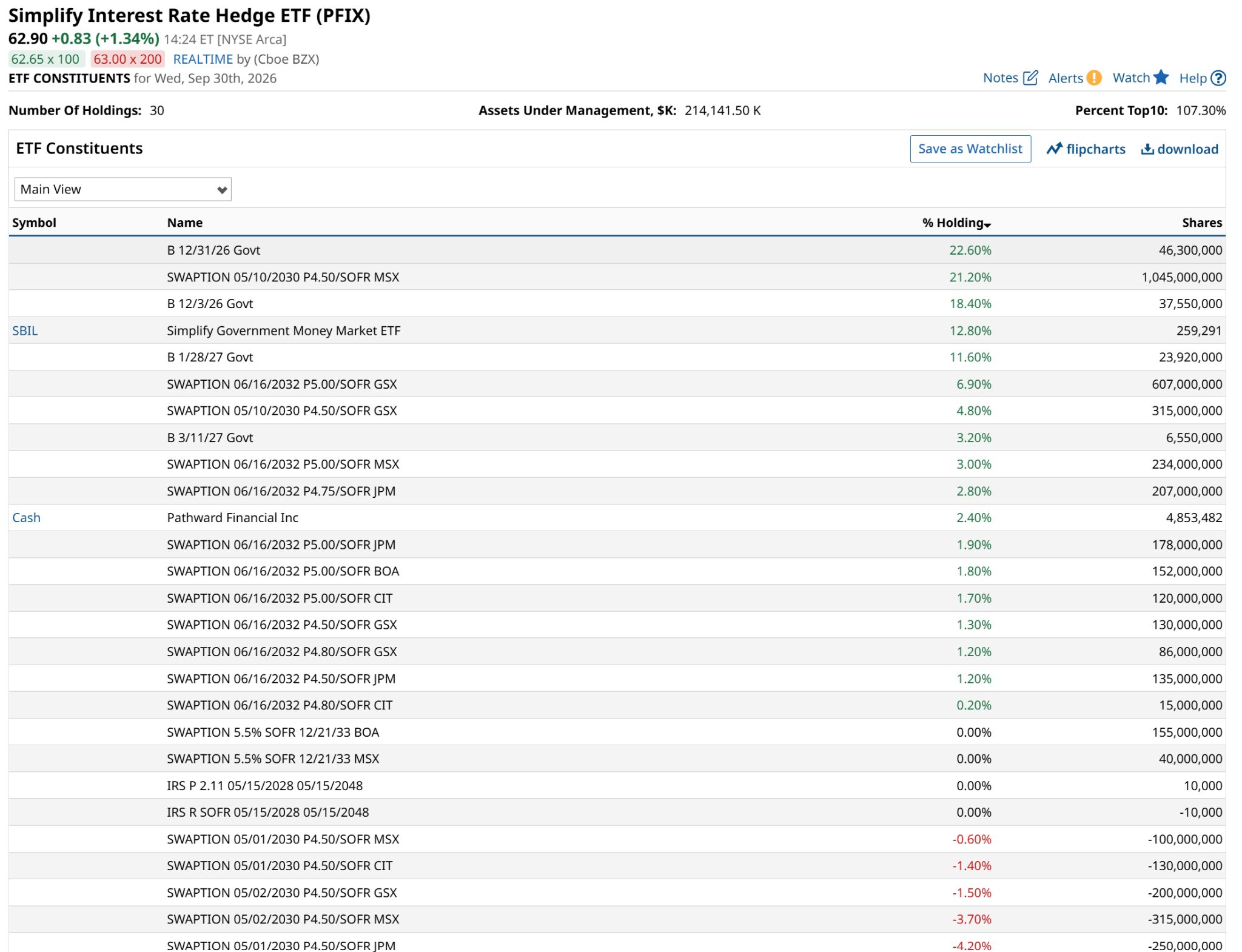 PFIX constituents.
 The key takeaways are that in order to try to profit from rising rates, PFIX works with big banks to create and own privately-purchased, custom-created long-term (seven years) put options on 30-year US Treasuries.
That seven year time to expiration of the puts is the key, since it blunts a lot of the volatility we might see in a leveraged ETF. They also diversify by counterparty, which reduces the risk of a “Lehman event” invading the usually routine process of having a big financial institution as your contract partner.
And since the biggest holdings of PFIX are T-bills, there is that cushion as well. Those serve as collateral to engage in the swaptions. The reason you see what appear as “short” positions on some swaptions (the red holdings above) is this: as time passes and the main contracts are successful at delivering that upside price movement from long-term rates rising (like right now), the managers of PFIX will sell contracts against their appreciated ones to lock in gains. That’s often preferable in their view to closing out a private placement like this before it expires.
While I can’t say I’ve ever traded swaps or swaptions, I’ve done plenty of options work. In the public options market, one can simply reduce the number of contracts.
Or in the case of the collar strategies I’ve written about here often, start by owning puts against an ETF or stock position, then write calls on it later. That type of thing is easy to do because the public options market is liquid. For swaptions, less so. Your counterparty is your only, shall I say, “option.”
Stepping back from the weeds, here’s a more bottom-line way to think of PFIX, based on its actual past results, in a range of market conditions. I’m just using this year, but showing one month total returns, on a daily basis.
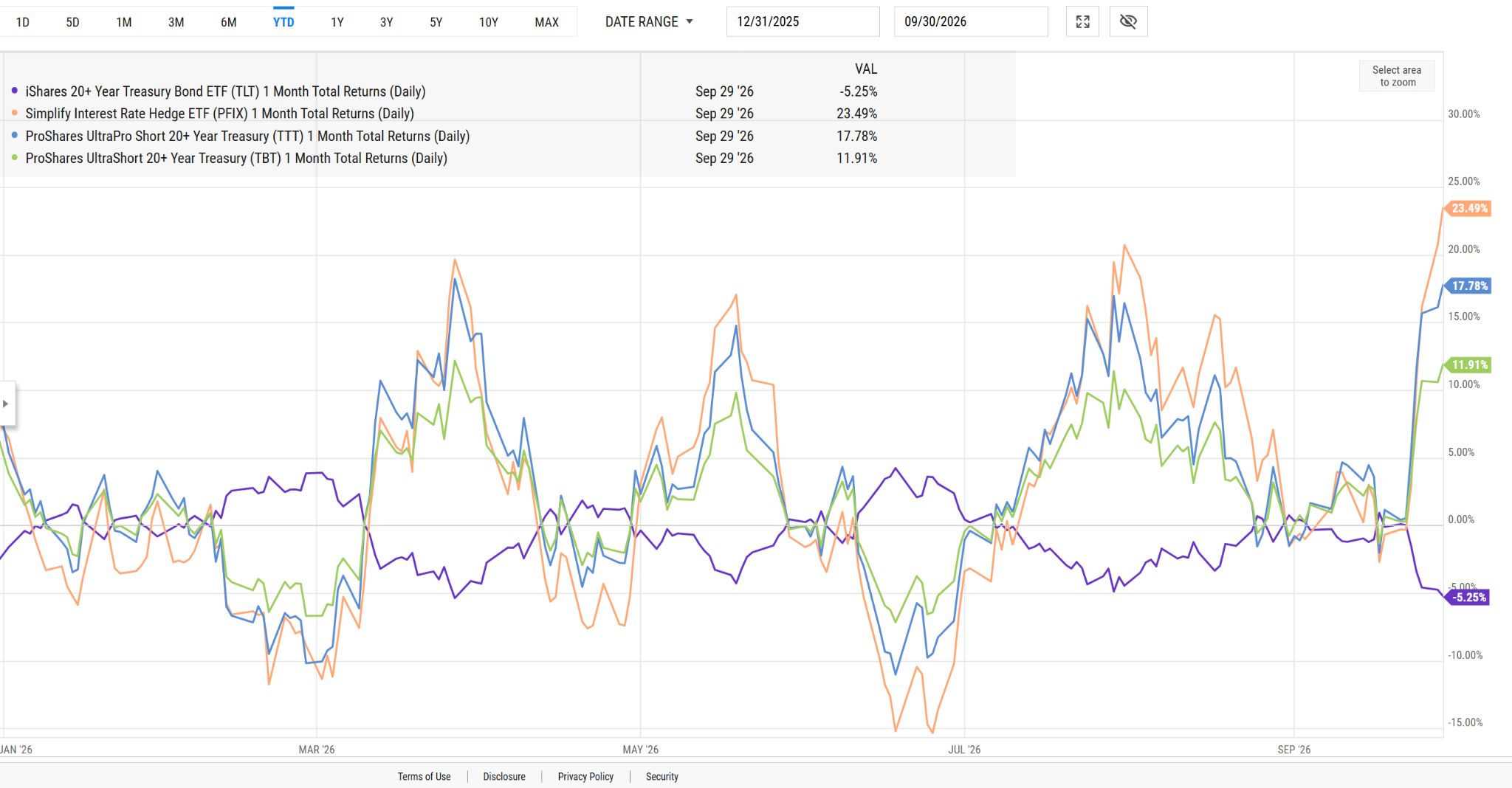 Courtesy of YCharts.
 Here’s what I see in that chart above. The iShares 20-Plus Year Treasury Bond ETF (TLT), the traditional way to profit from when interest rates decline, is in purple. ProShares Short 20 Plus Year Treasury -1X ETF (TBF) will perform roughly opposite to that.
But ProShares UltraShort 20 Plus Year Treasury ETF -2X ETF (TBT) and ProShares UltraPro Short 20 Plus Year Treasury -3X ETF (TTT) are really better peers compared to PFIX. They are 2x and 3x leveraged versions of TBF.
All three of those rising rate “hero” ETFs spike higher in price when rates rise, and TLT drops. The opposite is true, by design. But PFIX, in orange, is usually the most volatile in either direction. More so than even TTT, the 3x leveraged ETF.
Is PFIX Right for Your Portfolio?
How do you choose between them? That’s a personal decision, but the guidelines I follow are these:
First, decide if you care to hedge rising rates at all. If you own bonds, there might be some incentive to do so. If you don’t own bonds, you might simply decide you want to try to buy something that will go up. And, you are confident enough that rates will keep rising. Once you decide on the above, the real decision is less about which type of bond hedge you own. It is how much of it you own.Sticking with PFIX, its recent behavior (which might not be consistent over time) is that it tends to deliver about two to four times the volatility of TLT, but in the opposite direction, of course.
Taking a basic example, if you owned $1,000 worth of long-term bond “exposure” the traditional way (via ETFs or direct holding of bonds in your account), if you owned about $300 worth of PFIX, you would expect that would hedge away much of the risk. However, if your bonds were shorter-term, you might only need $100-$200 worth of PFIX.
In all cases, the best way to proceed is baby steps. I’ve literally bought 1 share of an ETF I am less familiar with, just to experience how it trades. Second-guessing yourself is easier that way. And like it or not, that’s a big part of successful long-term investing. Part of my ABL (Avoid Big Losses) mantra.
That is always at the core of this series on risk management. As I noted in the first article in this series, “learn what you wish to learn, learn it well, and have whatever you define as the right set of tools for your personal objectives.”
Rob Isbitts is a semi-retired CIO, former fiduciary investment advisor, and Barchart columnist. Check out his other work at ETFYourself.com (featuring the Fresh Charts weekly trading post), and ROAR.PiTrade.com, helping investors to better-manage their own portfolios.
On the date of publication, Rob Isbitts did not have (either directly or indirectly) positions in any of the securities mentioned in this article. All information and data in this article is solely for informational purposes. For more information please view the Barchart Disclosure Policy here.