

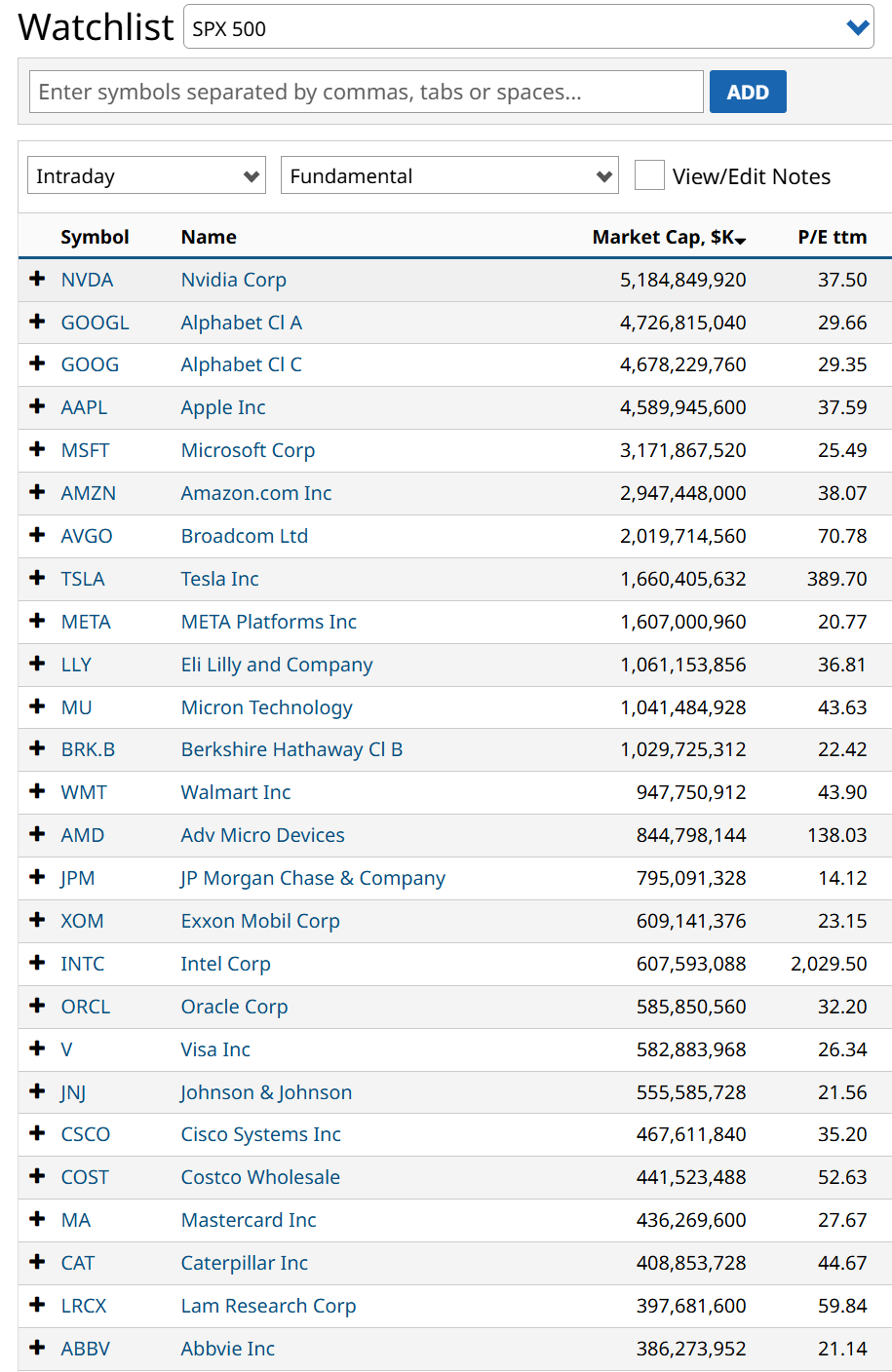
The S&P 500 Index ($SPX) is routinely described as a broad, diversified proxy for the health of the United States economy. A look under the index’s mathematical hood reveals that this diversification is officially dead. Right now, the top 25 largest stocks in the S&P 500 account for a staggering 52% of the total index weight.
 www.barchart.com
 Think about the sheer weight of that calculation.
More Yield, Less Trap: Sign up free to get Barchart’s daily Dividend Investor newsletter straight to your inbox.
The index contains 500 distinct corporate entities, yet the top 5% of those companies (25 out of 500) control the majority of the capital. If you own a standard, cap-weighted S&P 500 index fund like the SPDR S&P 500 ETF Trust (SPY), your money isn’t being distributed across an entire economic landscape. Instead, over half of every dollar you invest is being funneled into a highly concentrated basket of mega-cap operators heavily dominated by the artificial intelligence, semiconductor, and hyperscaler trade.
To understand just how extreme and fragile this setup has become, we have to contextualize it within long-term market history.
The Historical Trajectory of the Top 10 Concentration
While data for the top 25 specifically swings based on index rebalancings, Wall Street tracks the top 10 holdings as the primary indicator for systemic market concentration. Historically, the top 10 stocks held a cumulative weight of roughly 18% to 23% of the S&P 500, based on data from S&P Dow Jones Indices.
When you track the historic yearly figures for the top 10 companies’ market share, you can see exactly when the index transformed from a diversified basket into a top-heavy danger. And this informs the top 25 in that the top 10 are naturally higher-weighted stocks than the next 15. It is when that relationship goes to extremes that we have to start looking out below.
1990 – 1995: Stable concentration. The top 10 companies represented a healthy 18% to 19% of the total index. 1999 – 2000: Extreme concentration. Driven by the parabolic rise of early internet giants like Cisco (CSCO), Microsoft (MSFT), and Intel (INTC), the top 10 cumulative weight surged to a peak of 26% before the dot-com bubble burst. 2005 – 2015: De-concentration. Following the tech crash, market breadth expanded. By 2015, the top 10 accounted for a balanced 19% of the index. 2020: These are the extremes I just mentioned. Zero-interest rates and massive institutional flight into safe-haven tech behemoths pushed the top 10 weight to 27%, surpassing the dot-com bubble record. This has really just continued to accelerate, which is why I constantly refer to the start of 2020 as the “modern markets era.” Late 2024: The concentration surged to 34% as the Magnificent Seven trade monopolized global equity inflows. 2025 – 2026: The top 10 reached an unprecedented peak of 40%. Extending that out to the top 25 is what lands us at today’s mind-boggling 52% block.Historically, when index concentration rose, it was at least backed by equivalent corporate fundamentals. In 2015, the top 10 stocks commanded 19% of the index weight because they generated roughly 19% of the total index earnings.
Today, that relationship is completely broken. While the top 10 companies command over 40% of the index’s price valuation, they are only projected to generate roughly 32% of its actual, realized earnings. This means index investors are paying an extreme valuation premium for market cap weight, entirely disconnected from underlying fundamental growth.
History delivers a brutal verdict on these hyper-concentrated regimes. The two previous concentration peaks in 1980 (dominated by oil monopolies) and again in 2000 (dominated by legacy tech) were immediately followed by multi-year periods where the top-heavy giants severely underperformed the broader market.
Chasing the cap-weighted S&P 500 right now because “it only goes up” ignores the underlying reality. A market where 25 stocks dictate over half the score has zero margin for error. If a single core pillar experiences a fundamental slowdown, the mechanical unwinding will drag the entire index down.
What am I doing about this? First, acknowledging it. Not just by writing about it here, but in my own portfolio. I do have a decent allocation to the top 25 stocks. However, I am continuously hedged using inverse ETFs, leveraged inverse ETFs, put options, or option collars. Just because we are swimming in a liquidity bubble, that doesn’t mean we can’t stay close to shore.
Rob Isbitts created the ROAR Score, based on his 40+ years of technical analysis experience. ROAR helps DIY investors manage risk and create their own portfolios. For Rob’s written research, check out ETFYourself.com.
On the date of publication, Rob Isbitts did not have (either directly or indirectly) positions in any of the securities mentioned in this article. All information and data in this article is solely for informational purposes. For more information please view the Barchart Disclosure Policy here.
More news from Barchart
Robinhood Markets Just Introduced AI Agents for Banking and Trading. Here’s What You Should Know Before Buying HOOD Stock. Blockbuster Earnings Just Sent DELL Stock Soaring. What Comes Next. Meta Platforms Is Testing AI Chatbot Subscriptions. What to Know. Micron Isn’t Nvidia. It’s Time to Take Your Foot Off the Gas with MU Stock.